Visualising primes
Posted on 5th October 2019
Visiting a high school with my son, in the Maths classroom there was a poster on the wall, which visualised primes numbers. I only half remember what it said (taking a photo might have been a little bit weird, in the circumstances) but I think the little write-up at the bottom said that the calculations had been performed in Python, using trial division, and had taken half an hour. This immediately made me think of a prime sieve, so later I had a play with a sieve I had written in Python 3. I now think I must be misremembering, as I cannot see how even trial division could take half an hour in Python (even some years ago).
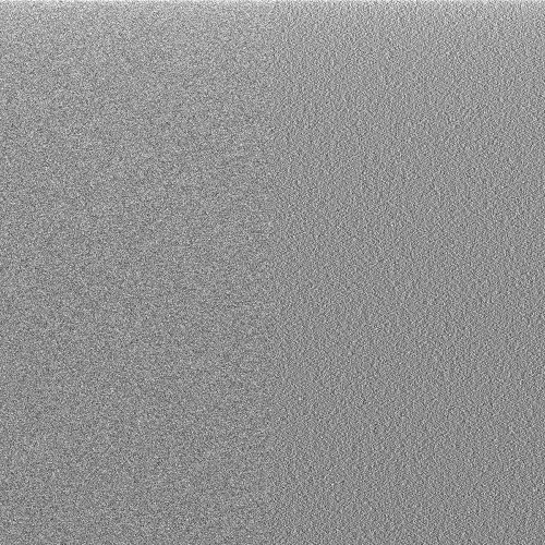
A 1000 by 1000 grid is quite a boring image, so I compute the first \( 10^8 \) primes (which takes about a minute for my sieve to compute) and plotted on a 10000 square pixel grid. This results in an almost black square, so I resampled and increased the brightness (in Python directly) which results in a pleasing picture, showing a slow decay in density, in line with the prime number theorem. One might think that the primes are roughly randomly distributed, but this question on math.stackexchange will put you right on this score. To experiment with visualising, I chose numbers are random, but in line with the decreasing density suggested by the prime number theorem. The result does look visually rather different:

To the left is the distribution of primes, and to the right random numbers. To my eyes, there is a clear difference.
Finally, a link to an undergraduate project which explores some further ideas for visualisation.
Code available on github